10
Flip Card Profile: Building an Interactive UI Developer Card with HTML & CSS
In this tutorial, we explore the creation of an interactive flip card profile for a UI Developer using HTML and CSS. The guide walks through the code, explaining the structure and styling to craft a visually appealing and functional component. The end result is a personalized flip card that reveals more information on hover, blending creativity and technology to enhance user interaction.
Flip Card Profile: Building an Interactive UI Developer Card with HTML & CSS
Creating engaging user interfaces requires a blend of creativity and technical skill. In this comprehensive tutorial, we will create an interactive flip card that showcases a UI Developer's profile using HTML and CSS. This card will flip when hovered over, revealing more information about Samantha, a fictional UI Developer.
HTML Structure
1. Main Card Container:
<div class="card">
<div class="card-front"></div>
<div class="card-back"></div>
</div>
This part of the code defines the main card container with two sides: front and back.
2. Back Card Content:
<h2>
Samantha
<br />
<span class="role">UI Developer</span>
<p>I blend creativity with technology as a UI Developer,
turning complex ideas into intuitive designs.
</p>
<p>
<span class="tagline">Tagline:</span>
Every Interaction, A New Adventure.
</p>
<p><span class="funfact">Fun Fact:</span>
Avid hiker and landscape
photography enthusiast.
</p>
</h2>
<div class="social-icons">
<a href="#" class="fa-brands fa-meta" aria-hidden="true"></a>
<a href="#" class="fa-brands fa-x-twitter" aria-hidden="true"></a>
<a href="#" class="fa-brands fa-linkedin" aria-hidden="true"></a>
<a href="#" class="fa-brands fa-instagram" aria-hidden="true"></a>
</div>
CSS Styling
1. Importing Fonts and Basic Styles:
@import "https://fonts.googleapis.com/css?family=Josefin+Sans:400,700";
This line imports the Josefin Sans font, adding a unique touch to the text.
2. Card Container:
.card {
/* Position and sizing */
transform: translate(-50%, -50%);
perspective: 600px;
transition: 1s;
}
Here, we center the card and define its size, perspective, and transition effect.
3. Front Side:
.card-front {
background-image: url(https://shorturl.at/qHV67);
background-position: 50% 50%;
background-size: cover;
/* More styles */
}
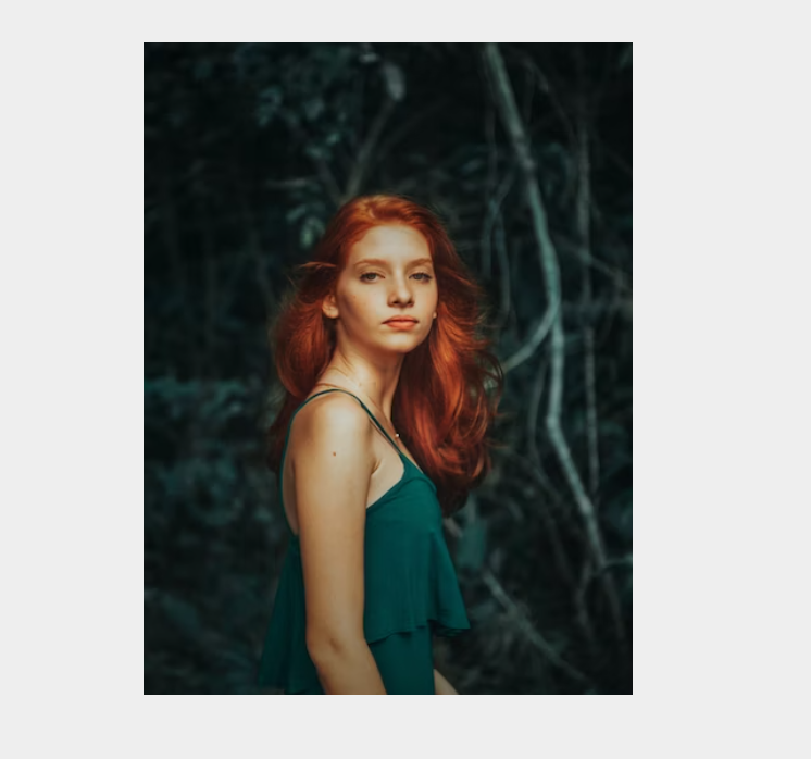
The front side features a background image, with additional styling to fit the image to the card.
4. Back Side:
.card-back {
height: 100%;
width: 100%;
position: absolute;
top: 0;
left: 0;
background-color: #000000;
backface-visibility: hidden;
transform: rotateX(180deg);
transition: 1s;
color: #ffffff;
text-align: center;
}
.card-back h2 {
margin: 17% auto 9% auto;
padding-left: 15px;
padding-right: 15px;
font-size: 26px;
}
.card-back h2 p {
font-size: 16px;
}
.card-back a {
height: 20px;
width: 20px;
padding: 5px 5px;
border-radius: 4px;
line-height: 20px;
}
.card-back a:hover {
color: #000000;
background-color: #fff;
}
The backside is styled with a black background, white text, and centered alignment.
5. Hover Effect:
.card:hover .card-front {
transform: rotateX(-180deg);
}
.card:hover .card-back {
transform: rotateX(0deg);
}
These lines create the flip effect when the card is hovered over, using the rotateX transform.
6. Additional Styling:
The provided code includes additional styling for text size, color, and etc. You can further customize these as needed.
.funfact {
font-size: 14px;
color:yellow;
}
.role{
font-size: 14px;
}
.tagline{
color:crimson;
}
Complete Code Codepen Link : Clickhere
Conclusion
We've successfully created an interactive and visually appealing flip card for a UI Developer, exploring each line of the HTML and CSS code. This detailed guide showcases the blend of design aesthetics and functionality that goes into a seemingly simple component.
Understanding how each part of the code contributes to the final product can empower you to create more complex and personalized designs. Happy coding! 🎨💻
Contact
Missing something?
Feel free to request missing tools or give some feedback using our contact form.
Contact Us